Diablo Media Website
Diablo Media’s site has two jobs: win performance marketing clients and convince good people to work here. As the agency’s sole graphic designer, I’ve designed and built every version since 2011. The current design dates to 2020, and in January 2026 I rebuilt everything underneath it.
The Challenge
Cool Palette, Heavy Build
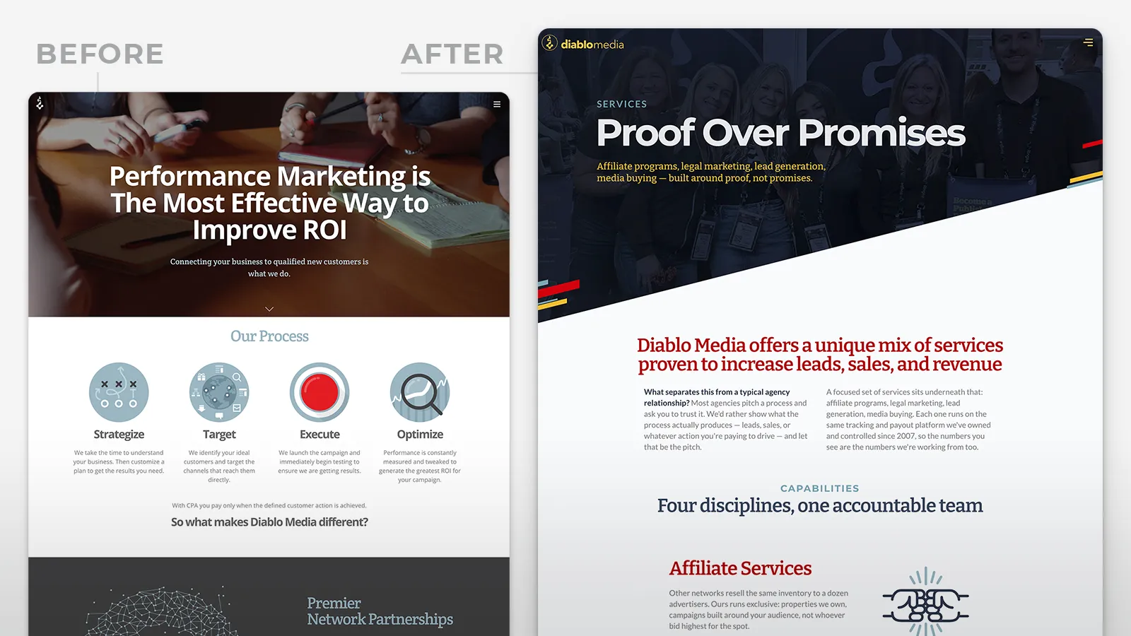
Before 2020, the brand ran on gray, red, and slate blue. Solid, and a little cold. The site also leaned on our downtown Denver office, which stopped mattering once everyone went home. Most performance marketing agency sites are an afterthought, so ours had room to stand out. Six years later the design still held up. The WordPress build under it didn’t: a feature-heavy theme and a stack of plugins, maintained by one person who’d rather work in code.
The Solution
Yellow, Blue, and Diagonals
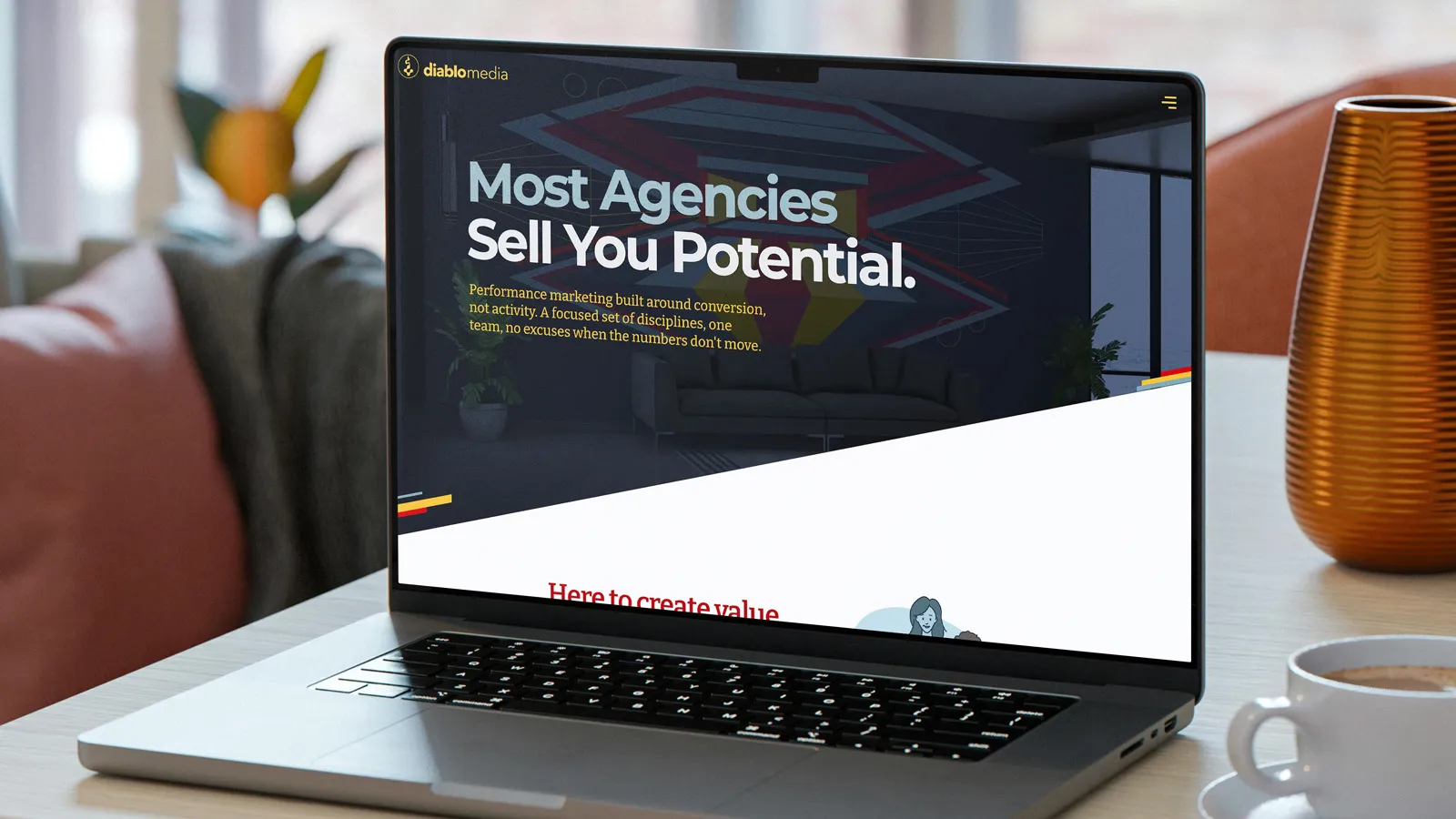
For the 2020 redesign, I added yellow and blue to the palette to warm the brand up, and pulled the diagonals from our logotype into the page layouts and custom illustrations. The team grid put our people up front for recruits. In 2026, with our VP of Technology backing the project, I moved the site to Astro and Tailwind, refined the design, and turned job listings into flat MDX files I deploy through GitHub.
The Results
Lighthouse Went From 79 to 99
Desktop Lighthouse jumped from 79 to 99. The theme and the plugins are gone. Adding a job opening takes one MDX file and a push to GitHub. The yellow, the blue, and the diagonals from 2020 made the move with a few refinements and are still the first thing visitors see.