Brax + Henley

Bold, playful wall art and decor for kids rooms that parents love.

The children’s decor market is often a sea of muted pastels and soft watercolors. Brax + Henley was born from a desire to break that mold, trading quiet aesthetics for bold lines, bright colors, and “outside-the-box” subject matter that celebrates the high energy of childhood.

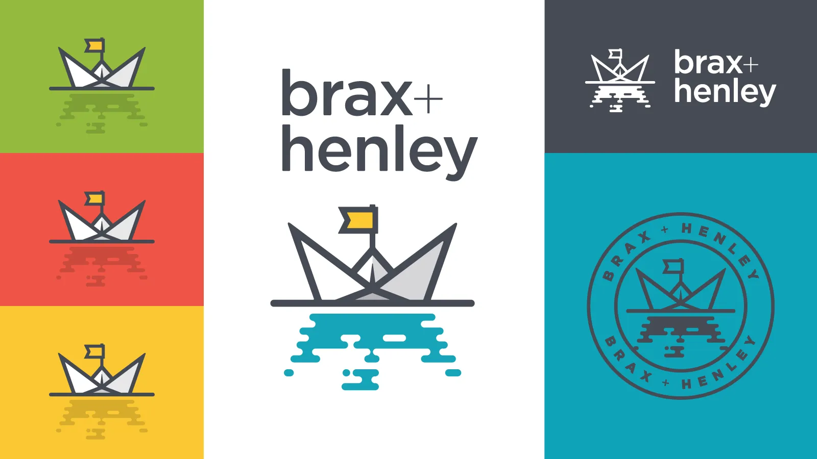
The visual identity centers on an origami boat logo—a symbol of “sailing for adventure.” This mark grounds the brand in a narrative of curiosity and exploration, setting the stage for a product line that ranges from motivational typography to character-driven storytelling.

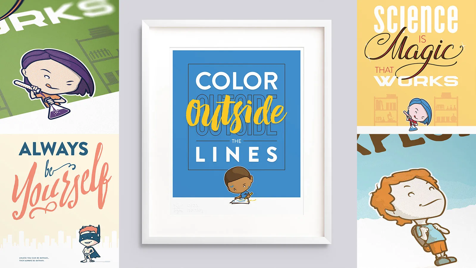
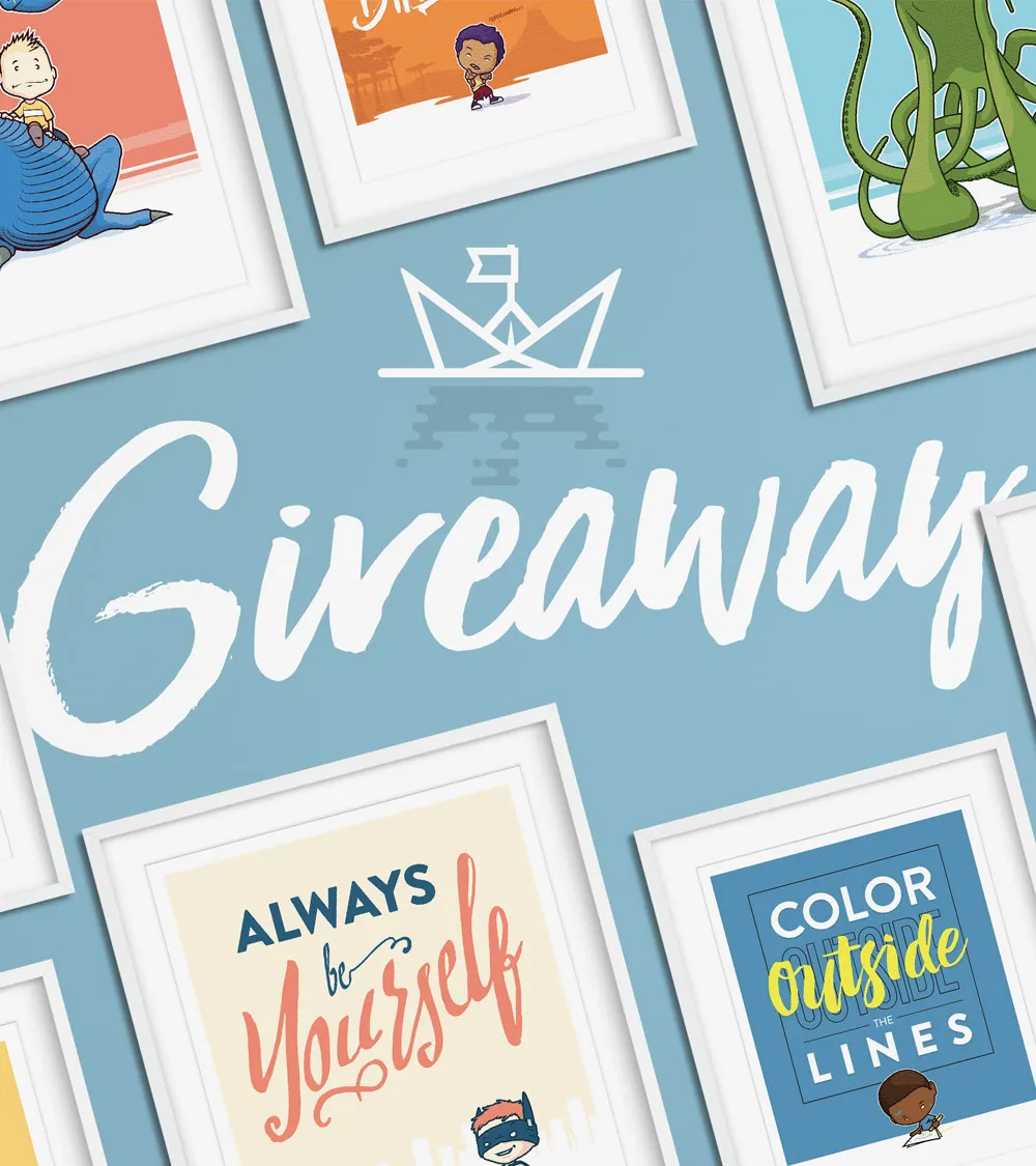
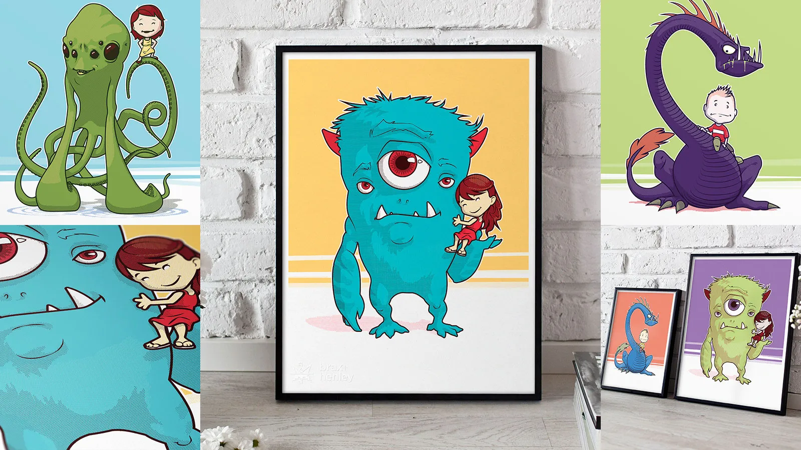
While the brand features a playful series of “Kids and Monsters” illustrations, the true heart of the shop’s success was the motivational poster collection. By combining bold, high-contrast typography with punchy color palettes, these pieces turned fun, positive sayings into modern art. These posters became the brand’s best-sellers, resonating with parents who wanted to surround their children with vibrant energy and positive reminders.

The project’s success was cemented by its tactile execution. Eschewing complex digital trends for a focus on raw illustration and personal touches, the delivery included a branded stamp for physical products. This “small-batch” feel helped Brax + Henley move beyond a simple personal project into a well-received brand that brought a sense of joy and adventure to many nurseries and playrooms.

Client Personal